But it's not only my personal opinion, it's the opinion of TCU as well.
Um, last I checked, TCU had decided to keep the Frog. So it seems they think it's okay after all. Frankly, if not for Nike, I doubt they would have ever considered replacing it. Might have simplified it a bit for embroidery purposes, but the same basic Frog.
In MY OPINION, you have a strong emotional attachment to the chubby Frog, and you can't see it for what it really is.
Well, everybody's entitled to HIS OPINION. Truth is, I have no strong attachment to the current Frog. If somebody can come up with a better-looking one, I'm game, but I haven't seen that yet.
I
do have a strong attachment to the TCU-Frog combination logo -- whatever the Frog looks like. Arched TCU by itself is just too vanilla and plain-Jane. More than half the teams in college football have just the school letters on the helmet.
"TCU: Just the Same as Everybody Else" is not my idea of distinctive branding. The combination logo set us apart as far as appearance goes -- not just another face in the crowd.
Here goes Deep being super-literal again.
Translation of "super-literal": There goes Deep taking my words at face value again. Dumbass couldn't even figure out the secret encoded meaning hidden within.
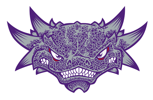
When I say "inaccurate", I don't mean "that is not a 100% accurate representation of the Texas Horned Lizard, anything but a photo won't do", I actually mean "it looks nothing like a bleeping Horny Toad".
Really?
Keeping in mind we're comparing a photo to a stylized graphical representation, I'd say the resemblance is easily detectable. Not saying we couldn't get a better Frog logo -- just saying it simply isn't true that "it looks nothing like a bleeping Horny Toad."
I assume you knew that's what I meant, but in an attempt to discredit my reasoning in order to make me look stupid and bolster your argument, you make a ridiculous straw man to tear down.
You assume wrong. Had no idea you intended, "Look, pay attention to what I
meant, not what I actually
said." Stupid of me, I know.
Pretty standard Deep Purple arguing
Pretty standard response by someone who's floundering: Attack the man instead of his argument.