rifram09
Active Member
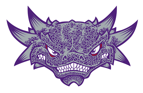
Deep I love the photo/cartoon Frog side-by-side comparison. It proves you can show some people the sky is blue and they'll argue for some other color. Other than a couple of persistent posters on this site I don't know one single Frog fan who doesn't like the Frog. Not one.
It's incredible the amount of flack the administration took before the Rose Bowl and how they finally caved to the fans wishes and came up with such a wonderful solution that everyone loved. This should have been the end of the discussion yet here the administration is once again showing their hubris by insisting they know what's best for the fans that we really shouldn't like that little Frog so much so we'll push it to the sideline and eventually out the back door. That's evidenced by the fact that you can have the Frog but not with the arched logo. Why the hell not and why does their combination matter? I guess we are all supposed say "yeah that's logical...that makes sense?
Guys. It's not a big deal. The vast majority of people won't even know we made a change. I would bet that most that do realize we made a change won't even care.
I think the Arched TCU "looks" more traditional than the current frog. I understand the argument that just having letters as primary logo is "just like everybody else," but I'm just not buying it. Let's say you are right and our logo isn't the most unique in NCAA. So what? If it is recognizable (which arched "TCU" obviously is), then the logo is effective. Then it all come down to preference. I prefer the more traditional look rather than a artists' rendering of a frog on our logo. I think it looks cartoonish, Deep. By that I mean, it looks more like looney tunes than reality. I don't hate it, but I like the idea of taking it out of my main logo.