Peacefrog
Degenerate
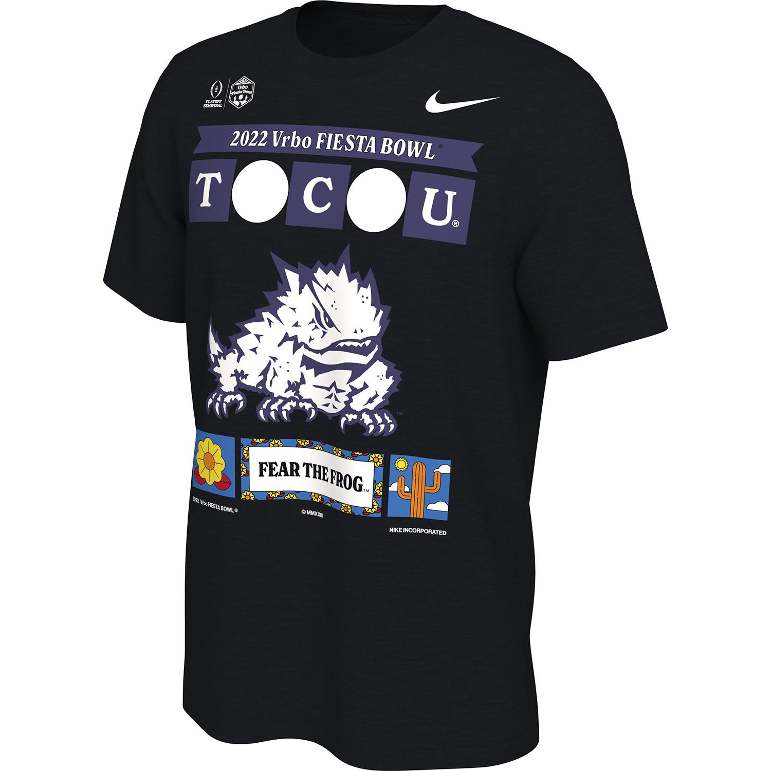
I wouldn’t even donate that shirt to goodwill.Look at this one. Did TCU take Tech's birthright from them?
I wouldn’t even donate that shirt to goodwill.Look at this one. Did TCU take Tech's birthright from them?
I think that’s supposed to be State Farm Stadiumwhy is there a grey couch in the middle of that first t-shirt?
Goodwill would probably tell you to keep it. Thanks but no thanks lol.I wouldn’t even donate that shirt to goodwill.
My 6 year old nephew could draw a better picture of the stadium with his crayons.I think that’s supposed to be State Farm Stadium
This can’t be real….surely….?? I mean there are so many issues with this. Wth?
This will be the type of shirt you see on nature documentaries that the random tribe in Africa or the Amazon is somehow wearing ten years later.

Great job if that's what they were going for because it is UGLY!It is ugly sweater season.
Needs more lightning bolts or something…Look at this one. Did TCU take Tech's birthright from them?
In soccer clubs and national teams just permanently add a little star under their logo on the shirt for every major tournament they win. That's basically just semi-classy low key trolling off all their rivals.That shirt sucks ass like all the others. Game-specific gear is typically awful but damn they reached peak cringe this year.
I just want a new TCU cap with the CFP logo on the side. Time to replace my 2014 TCU hat that has the peach bowl logo on the side. Like those somewhat subtle logos on otherwise standard gear to wear around DFW or to away games to remind other fans “TCU has been there and your team hasn’t” —- but in, you know, a classy/not tacky way. I’d also buy a purple polo with the CFP logo under the arch TCU in a heartbeat.
I could see Mrs Pharm wearing that. Could be in rotation with her Polygamy Porter shirt I got her from Park City.I went with this for the trip:
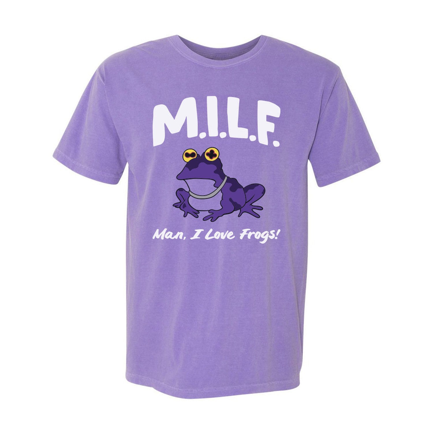
Where did you find this shirt? *asking for a friendI went with this for the trip:
I think that’s supposed to be State Farm Stadium
Here's your hat: https://www.bkstr.com/tcustore/product/clothing-accessories/cap-adj-22-playoff-purpl-h-adj-240321-1That shirt sucks ass like all the others. Game-specific gear is typically awful but damn they reached peak cringe this year.
I just want a new TCU cap with the CFP logo on the side. Time to replace my 2014 TCU hat that has the peach bowl logo on the side. Like those somewhat subtle logos on otherwise standard gear to wear around DFW or to away games to remind other fans “TCU has been there and your team hasn’t” —- but in, you know, a classy/not tacky way. I’d also buy a purple polo with the CFP logo under the arch TCU in a heartbeat.
The hat is fine, but both those shirts are fit only for tearing up into rags, and even then you can only use the back.
Frankly, the hat could be a lot better too. Having both the game and trophy logos on the same side is weird. Put the game logo on one side. Large trophy logo centered on the back - done. What's so tough about that?

